 Montauk Daisies
2009, Oil on Canvas on Board, 16 x 12"(SOLD)
Signed lower left. Harding 09'For clients who want to own an original Harding painting, yet want a specific subject portrayed, I offer a commission service.
Montauk Daisies is a good example of this. The client loved what they saw in another painting I did of Roses, yet their favorite flowers were Daisies.
So much so, they even have daisies painted on their fingernails. Since the fall was coming I found Montauk Daisies, which typically bloom in October. The name of these daisies conjured up images of fresh-picked flowers at a seashore beach house. So I placed the setup on a windowsill, poured sand in the bottom of the vase, and put two seashells in the foreground. Sun, streaming in through the window, completed the feeling of warmth I wanted to convey.
Currently, I am also working on commissioned paintings of a young gymnastic star and a cityscape painting of the Philadelphia sports complexes.
Have you always wanted an original painting of a family member, pet, or favorite vacation spot? Challenge me to paint what you have in mind today.
I'm back in class again with Jafang Lu for another intensive workshop on studying the effects of light on subjects. The intimate class, made up of 4 students and the teacher, is a great way to supercharge learning and practice techniques that will find their way into my more involved paintings. I was happy to learn that we will be doing some longer studies, even one up to 4 weeks. So, I will have some very finished pieces and some of these will be available at my online Etsy store.
Class 1


The first night we warmed up with two 45-minute studies, one of a ceramic milk jug, and the other of a blue coffee cup and pear.
Jafang chose my next study of a blue bottle and lemon to paint over and demonstrate to the class how to simplify areas before adding more detail. Notice how elegant the shapes of color on the bottle culminate into depictions of reflections and transparency. My inclination is to start adding detail too soon which can be burdensome later on in the process.
Tune in next Wednesday. I'll be posting a study of a beautiful Conch shell!
-----------------------------------------------------------------------------------------------------
Class 2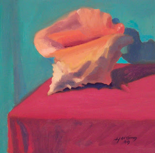 Conched Out
2009, Oil on Canvas on Board, 12 x 12"
(Signed lower right - Harding 09')
Tune in next week. I'll be posting a study of a brown bag lunch!
Sold
-----------------------------------------------------------------------------------------------------
Class 3 Brown Bag Lunch2009, Oil on Canvas, 16 x 20"
(Signed lower left - Harding 09')
Tune in next week. I'll be posting a painting of some Halloween gourds.
Sold
-----------------------------------------------------------------------------------------------------
Class 4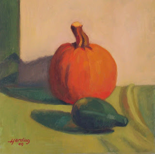 October Still
2009, Oil on Canvas, 12 x 12"
October Still
2009, Oil on Canvas, 12 x 12"
(Signed lower left - Harding 09')
Tune in next week. I'll be posting a painting of some Stone Harbor memories.
Bid on this painting!
-----------------------------------------------------------------------------------------------------
Class 5,6,7

Stone Harbor Memories2009, Oil on Canvas, 11 x 11"
(Signed lower right - Harding 09')
(C) 2009 JT Harding
This painting was worked up in three classes. The first class, we did a color study and the next two classes, we worked up the finished painting. Next, I'll be working on a 5 session still life. Ugh!
Sold
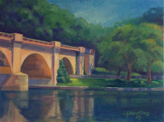 In early August, my friend Zack and his Mother, told me they were out painting a bridge over the Schuylkill River, so I joined them the following day.
The view from the West River Drive side of the Schuylkill was exceptional for a great composition, and in fact was painted from this very view by several artist's in the past.
Buy NOW!
Rather than trying to capture the entire span of the bridge, I chose to focus on the interesting convergence of the bridge, land, and trees on the other side of the river. In particular, I found the sun-lit patch of grass near the bridge to be a great focal point. After two Plein Air sessions, to establish the composition and color relationships, I finished this in my studio on September, 10th.
A little history on the Bridge.
The graceful concrete arches of the Columbia Bridge carry the main stem of the former Reading Railroad over the Schuylkill River into Philadelphia. Built between 1917 and 1921, the bridge was a critical link between the Reading's passenger terminal in Philadelphia and the shops and freight yards in the City of Reading in Berks County. The current bridge is the third bridge on its site and crosses the Schuylkill just below the famed Regatta Course along Kelly Drive in Fairmount Park.
This was my first finished Landscape painting since 2007 and I hope to do more, although my next focus will be on people within the Landscape. So, keep your eyes peeled ...
 I painted this from life on a Monday and Tuesday, posted it on facebook on Wednesday and it sold on Friday. This was my first floral painting. Hmmm, maybe I should do more like this?
Summer's Finale
2009 Oil, On Canvas, 16 x 12"
Sold
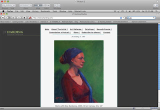 Website with brand ID and content.Prior to launching my career as a working artist and painter, I focused mostly on creating and building winning brands for companies. So it’s no coincidence that I have taken great care in building and communicating my own individual brand.
As the sole owner, operator, and painter of Harding Studios, I am the brand. And, the paintings I produce and sell are products of the brand. Having started with the brand called me, I needed to understand several insights that would help differentiate me from all other artists, provide motivation and inspiration for executing paintings, and culminate into something meaningful for the collectors of my work.
The result was Sensual Realism. Let me break it down.
I’ve come to believe that the there are four key ingredients to an artist; Lifestyle, Influences, Technique, and Inspiration. Collectively, these traits produce works of art that appeal to people and organizations with like minds. In our art world they are called Art Collectors, Patrons, Gallery’s, and Clients.
Lifestyle: A single Los Angeles artist who parties all night and has tattoo sleeves leads a different lifestyle than one who is married with children and lives in Tulsa. Their art sensibilities are different too. So when I looked at this factor, I had to peg myself as the Consummate Bachelor type. This doesn’t mean that I won’t get married. In fact, Madonna got married (several times) but she is still kind of the Bad Girl type.
Influences: Which deceased and living artist is the artist most drawn toward? For me, it’s John Singer Sargent, Sorolla, and Anders Zorn among others. I am also drawn to Artist’s, like Jeremy Lipking and Richard Schmid because they also have been influenced by the same genre of deceased artists. These artists chronicle their times but do so in a way that gives viewers an artistic impression versus an ultra realistic portrayal of their subjects. They leave something up to the imagination (or Senses). I once read that a Sargent critic believed that his portraits not only conveyed the sitter’s likeness, but also the emotional state of the population at the time.
Technique: Technique is how the Artist executes his or her work. Is their technique photo-realistic, is it impressionistic conveying light and shade in broken color, or perhaps its colorist, overemphasizing the effects of light on subject matter? My technique is decidedly painterly, both as a result of my influences and innate sensibilities. For the way I’m wired, I have no interests or the patience to re-create a subject or scene the way a camera does. I’ll leave that to professional photographers. However, if you are interested in a representational painting executed in fluid painterly realism, and expressed with light-filled sensibility, I’m your Man.
Inspiration: To an artist, inspiration appears in many forms. Boiled down to its core, inspiration comes from visually stimulating subjects such as the great outdoors, shapely nude figures, pretty faces, cute pets, or interesting objects. Inspiration can also come from seeing the way another artist painted a certain subject, or from the sudden flash of an idea conceived in the mind. This is probably one of the most important aspects of an artist works because what inspires the artist, must be ultimately conveyed on the canvas to inspire the viewer. Inspiration, informs and influences an artist’s product and provides the needed motivation to cover blank canvases with paint. A Sargent biographer noted that some critics found several of his portraits cold and impersonal while other were full of dramatic poses and interesting accoutrements. This difference was attributed to the level of inspiration he had with each sitter. Personally, exotic and interesting people, places and objects inspire me. For instance, one of my inspirations came from a beautiful young Model in London and a painting of one of my favorite artists. I am working on a book that will reveal some of my inspirations in action. If you’d like advanced notice of the books publishing date, you can sign up for my email newsletter.
Wrapping up, if you look closely at my art, and promotional materials including my website, blog, facebook pages, Artist Statement, Biography, and Resume, you will see a thread of Sensual Realism that weaves throughout each piece. This is my brand at work.
PS: If I had to write a definition of Sensual Realism, this is how (a lofty) one might sound: Sensual Realism: A sub-category of Realism and brand of JT Harding art that represents real-life imagery in a fluid, and painterly fashion. His works of art are derived from and inspired by sensual subjects including exotic places, interesting people and rare or unique objects. Viewers of sensually realistic paintings are immersed in a visually stimulating, and pleasurable experience that ignites their hearts and minds and transcend both time and place.

 Yesterday, I started a new workshop with Instructor JaFang Lu (click on the title to visit her website) to learn more about color. Specifically
  how to capture the impression of light on the subjects being painted.
 The emphasis of the class is on understanding color relationships;
  how to see and

 paint color relationships as opposed to local colors, and how to key the painting and use colors effectively to capture the impression of light.
My hope is, that by the end of the class, I can begin to use color effectively in all my paintings and avoid the muddy colors and pasty whites that want to creep onto my canvas. We started with a discussion of the method of painting handed down from the impressionists to William Merritt Chase, re-formulated by Henry Hensche, and mastered by Nelson Shanks and his Studio Incamminati students… including Jafang. Then, we toned our canvas with a grey mid-tone that can be mixed either warmer or cooler depending on what you want to achieve. Each student picked out a composition comprised of two still life objects, a table cover color, and background color. The composition is purposely kept simple at this point so that the artist can see the color relationship between the 4 basic colors. Our goal was to achieve the harmonious effect of the warm light on the objects. Jafang asked us to study a problem and come up with a solution through a study of the still life.
"We paint problems in order to be able paint pictures and if we are good we keep doing problems all our lives and the more humbly we stick to that attitude the better we paint."
- Henry Hawthorne
I chose an apple in front of a paper towel roll on a purple table cover with a green background. The reason I chose this is because of how hard it is for most artists, including me, to paint white (i.e.: the paper towel roll.) First we drew a grisaille to establish the composition and darks associated with the color shadows. Then we quickly painted in our best guess of the color of each object. I scanned over the whole composition looking for my first impression and quickly mixed the colors, putting them in the light areas of the objects while leaving the hardest object (the paper towel roll) for last. Once these colors were in, I made my best guess at the paper towel color and mixed a cool blue with white. The instructor asked me to step way back from my painting, glance at the still life setup and then look at my painting and tell her where I was off. The paper towel roll stuck out like a sore thumb. It was actually much warmer than I had painted it. I added a couple touches and she also made some adjustments based on her own impressions. Usually, we have a homework assignment to do after class so I've posted a picture of each week's class study along with the following week's homework assignment.
----------------------------------------------------------------------------------------------------------------

 I am working on a comissioned portrait of Sarah in Yellow dress inspired by the late Philip Alexius de Laszlo (British: 1869-1937). de Laszlo was a contemporary of John Singer Sargent and painted some of the same sitters. You can see more of his work by linking from the blog title. The inspiration painting is a portrait sketch he worked on in 1915 to finish a painting of the Honorable Ivy Gordon-Lennox (1887-1982).
I've posted the inspiration painting and my work in progress. Check back in again soon to see the final painting.
 This is kind of a hokey post but maybe other Artists will identify with it. I've always liked the excitement when I've finished a sketch or completed a final piece, to see what it will look like in a frame.
I often use a frame I have on hand to envision what the work-in-progress will look like when it's complete. So, when I found this resource online, I was thrilled. Pictureframes.com is where I get most of my frames and I recently discovered that they offer a service that allows you to upload your art, choose a frame/size, and see what the two look like the together. It's sorta of a try-before-you-buy service. You can even enlarge the final sample and save it as a .jpg for use in promotional materials, websites, blogs, etc. The samples shown above lets me or my client see what the paintings will eventually look like in some of their ready-made-frames. Give it a try. If you are having trouble, leave me a comment and I'll walk you through the steps.
 The Boxer
2009, Oil on Canvas
18 x 14"I spent Mother's day at Open Studio and three hours later came out with this portrait sketch in Oil. I don't remember the models name so I'm calling the painting "The Boxer" for now.
Then I called my Mom and wished her a happy Mothers Day.
 1) Grisaille underpainting establishes masses of light and shadow.
 2) Color block-in to establish initial color relationships and light key.
 3) Refinement of color relationships including color variations in light and shade areas.
 4) Adding subject specific details and modeling the form.
 5) Final details including definition of hard and soft edges, eye and whisker details, and final signature.


