August 3, 2009

Sensual Realism – My brand of painting explained.

Website with brand ID and content.

Prior to launching my career as a working artist and painter, I focused mostly on creating and building winning brands for companies. So it’s no coincidence that I have taken great care in building and communicating my own individual brand.

As the sole owner, operator, and painter of Harding Studios, I am the brand. And, the paintings I produce and sell are products of the brand. Having started with the brand called me, I needed to understand several insights that would help differentiate me from all other artists, provide motivation and inspiration for executing paintings, and culminate into something meaningful for the collectors of my work.

The result was Sensual Realism. Let me break it down.

I’ve come to believe that the there are four key ingredients to an artist; Lifestyle, Influences, Technique, and Inspiration. Collectively, these traits produce works of art that appeal to people and organizations with like minds. In our art world they are called Art Collectors, Patrons, Gallery’s, and Clients.

Lifestyle: A single Los Angeles artist who parties all night and has tattoo sleeves leads a different lifestyle than one who is married with children and lives in Tulsa. Their art sensibilities are different too. So when I looked at this factor, I had to peg myself as the Consummate Bachelor type. This doesn’t mean that I won’t get married. In fact, Madonna got married (several times) but she is still kind of the Bad Girl type.

Influences: Which deceased and living artist is the artist most drawn toward? For me, it’s John Singer Sargent, Sorolla, and Anders Zorn among others. I am also drawn to Artist’s, like Jeremy Lipking and Richard Schmid because they also have been influenced by the same genre of deceased artists. These artists chronicle their times but do so in a way that gives viewers an artistic impression versus an ultra realistic portrayal of their subjects. They leave something up to the imagination (or Senses). I once read that a Sargent critic believed that his portraits not only conveyed the sitter’s likeness, but also the emotional state of the population at the time.

Technique: Technique is how the Artist executes his or her work. Is their technique photo-realistic, is it impressionistic conveying light and shade in broken color, or perhaps its colorist, overemphasizing the effects of light on subject matter? My technique is decidedly painterly, both as a result of my influences and innate sensibilities. For the way I’m wired, I have no interests or the patience to re-create a subject or scene the way a camera does. I’ll leave that to professional photographers. However, if you are interested in a representational painting executed in fluid painterly realism, and expressed with light-filled sensibility, I’m your Man.

Inspiration: To an artist, inspiration appears in many forms. Boiled down to its core, inspiration comes from visually stimulating subjects such as the great outdoors, shapely nude figures, pretty faces, cute pets, or interesting objects. Inspiration can also come from seeing the way another artist painted a certain subject, or from the sudden flash of an idea conceived in the mind. This is probably one of the most important aspects of an artist works because what inspires the artist, must be ultimately conveyed on the canvas to inspire the viewer. Inspiration, informs and influences an artist’s product and provides the needed motivation to cover blank canvases with paint. A Sargent biographer noted that some critics found several of his portraits cold and impersonal while other were full of dramatic poses and interesting accoutrements. This difference was attributed to the level of inspiration he had with each sitter. Personally, exotic and interesting people, places and objects inspire me. For instance, one of my inspirations came from a beautiful young Model in London and a painting of one of my favorite artists. I am working on a book that will reveal some of my inspirations in action. If you’d like advanced notice of the books publishing date, you can sign up for my email newsletter.

Wrapping up, if you look closely at my art, and promotional materials including my website, blog, facebook pages, Artist Statement, Biography, and Resume, you will see a thread of Sensual Realism that weaves throughout each piece. This is my brand at work.

PS: If I had to write a definition of Sensual Realism, this is how (a lofty) one might sound: Sensual Realism: A sub-category of Realism and brand of JT Harding art that represents real-life imagery in a fluid, and painterly fashion. His works of art are derived from and inspired by sensual subjects including exotic places, interesting people and rare or unique objects. Viewers of sensually realistic paintings are immersed in a visually stimulating, and pleasurable experience that ignites their hearts and minds and transcend both time and place.

June 25, 2009

How to Paint the Effect of Light with JaFang Lu

Yesterday, I started a new workshop with Instructor JaFang Lu (click on the title to visit her website) to learn more about color. Specifically how to capture the impression of light on the subjects being painted.

The emphasis of the class is on understanding color relationships; how to see and paint color relationships as opposed to local colors, and how to key the painting and use colors effectively to capture the impression of light.

My hope is, that by the end of the class, I can begin to use color effectively in all my paintings and avoid the muddy colors and pasty whites that want to creep onto my canvas. We started with a discussion of the method of painting handed down from the impressionists to William Merritt Chase, re-formulated by Henry Hensche, and mastered by Nelson Shanks and his Studio Incamminati students… including Jafang. Then, we toned our canvas with a grey mid-tone that can be mixed either warmer or cooler depending on what you want to achieve. Each student picked out a composition comprised of two still life objects, a table cover color, and background color. The composition is purposely kept simple at this point so that the artist can see the color relationship between the 4 basic colors. Our goal was to achieve the harmonious effect of the warm light on the objects. Jafang asked us to study a problem and come up with a solution through a study of the still life.

"We paint problems in order to be able paint pictures and if we are good we keep doing problems
all our lives and the more humbly we stick to that attitude the better we paint."
- Henry Hawthorne

I chose an apple in front of a paper towel roll on a purple table cover with a green background. The reason I chose this is because of how hard it is for most artists, including me, to paint white (i.e.: the paper towel roll.) First we drew a grisaille to establish the composition and darks associated with the color shadows. Then we quickly painted in our best guess of the color of each object. I scanned over the whole composition looking for my first impression and quickly mixed the colors, putting them in the light areas of the objects while leaving the hardest object (the paper towel roll) for last. O
nce these colors were in, I made my best guess at the paper towel color and mixed a cool blue with white. The instructor asked me to step way back from my painting, glance at the still life setup and then look at my painting and tell her where I was off. The paper towel roll stuck out like a sore thumb. It was actually much warmer than I had painted it. I added a couple touches and she also made some adjustments based on her own impressions. Usually, we have a homework assignment to do after class so I've posted a picture of each week's class study along with the following week's homework assignment.
----------------------------------------------------------------------------------------------------------------

June 1, 2009

Philip Alexius de Laszlo

I am working on a comissioned portrait of Sarah in Yellow dress inspired by the late Philip Alexius de Laszlo (British: 1869-1937). de Laszlo was a contemporary of John Singer Sargent and painted some of the same sitters. You can see more of his work by linking from the blog title. The inspiration painting is a portrait sketch he worked on in 1915 to finish a painting of the Honorable Ivy Gordon-Lennox (1887-1982).

I've posted the inspiration painting and my work in progress. Check back in again soon to see the final painting.

May 20, 2009

I've been Framed

This is kind of a hokey post but maybe other Artists will identify with it. I've always liked the excitement when I've finished a sketch or completed a final piece, to see what it will look like in a frame.

I often use a frame I have on hand to envision what the work-in-progress will look like when it's complete. So, when I found this resource online, I was thrilled. Pictureframes.com is where I get most of my frames and I recently discovered that they offer a service that allows you to upload your art, choose a frame/size, and see what the two look like the together. It's sorta of a try-before-you-buy service. You can even enlarge the final sample and save it as a .jpg for use in promotional materials, websites, blogs, etc. The samples shown above lets me or my client see what the paintings will eventually look like in some of their ready-made-frames. Give it a try. If you are having trouble, leave me a comment and I'll walk you through the steps.

May 11, 2009

The Boxer

The Boxer
2009, Oil on Canvas
18 x 14"


I spent Mother's day at Open Studio and three hours later came out with this portrait sketch in Oil. I don't remember the models name so I'm calling the painting "The Boxer" for now.

Then I called my Mom and wished her a happy Mothers Day.

April 22, 2009

Portrait Sketch Sold to Friend and New Fan.

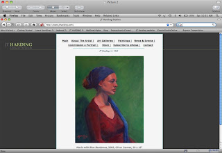
This week, my Painting Maria with Red Bandanna was sold to Dr. and Mrs. Robert Thomson of Chestnut Hill, PA. Christine, an acquaintance of mine, saw the piece at my house and immediately wanted it for her art collection.

I thanked her for the sale and told her I’d frame, sign, and deliver the art to her home pronto. Christine greeted me at her door with wild-eyed anticipation and child-like enthusiasm. As I walked into her home, I was struck by the couple’s love of fine art and humbled that my piece would find a nice home in their awe-inspiring collection of paintings and sculptures.

Soon after I delivered it, Christine took a picture of the piece hanging on her wall and emailed it to me along with some other thoughts on my work.

J.T. Harding’s work is compelling to me on many levels. His minimal brush work creates a clarity that brings depth to his subjects: portraiture, landscapes and still life that can easily be overlooked in the hands of less skilled artists.

Maria with Red Bandanna is an important addition to our art collection and captivated me for these reasons as well as J.T.’s ability to bring to his work a story with emotion, character and mystery that adds depth and meaning to a moment in time he captures on canvas."

It is so gratifying to see how appreciative people are of art and how it can make a house a home. It is particularly inspiring seeing the art you made adding enjoyment to someone's life for years to come. Thanks again to the Thomsons for making me want to create even more.

March 29, 2009

My Career and Lifestyle Vision Board

In the photo to the left you will see a Vision Board I put together recently to manifest a new career path and resulting lifestyle that I would like to lead. My idea for the Vision Board came after seeing success expert John Assaraf relating his story of using Vision Boards to achieve his dreams in the best-selling DVD documentary The Secret.

So what is a Vision Board?


A Vision Board is simply a visual representation or collage of the things that you want to have, be, or do in your life. It consists of a poster or foam board with cut-out pictures, drawings and/or writing on it of the things that you want in your life or the things that you want to become. The purpose of a Vision Board is to activate the law of attraction to begin to pull things from your external environment that will enable you to realize your dream. By selecting pictures and writing that charges your emotions with feelings of passion, you will begin to manifest those things into your life. Interestingly, the board is suppose to activate the reticular activating system in your brain (RAS). This is a selective attention filter that makes you aware of daily things that can help you achieve your goal. But, it’s your job to take action on those opportunities when they present themselves.

My Vision Board breakdown.


The top half of the board contains visuals of the fine art career I am manifesting as I write this. My goal is to become a successful professional artist, painter, and teacher with the time and resources to travel the world and make a difference in the lives of others. Of course, I’d like to have a beautiful wife and children to share my life with and a coastal house to inspire me and provide me with a healthy, relaxing lifestyle.

Tell me about your vision board by commenting below.

March 23, 2009

Stephanie on Purple Chair

My latest three-hour figurative sketch.

March 16, 2009

Ellen in Repose


My latest 3-hour figure sketch of red headed model and artist Ellen.

March 3, 2009

Last pose at Studio Incamminati Portrait Workshop


I have posted my four finished works (below) from this class but wanted to highlight the various stages of finish that each 3-hour session produces toward a final image. My hope is that you and I see the progression (warts and all) during this process.

Night 1) Tonight the pose and vantage point is excellent. I am painting on a lead primed linen canvas that is 16 x 16” square. Not your typical portrait size canvas, but I wanted to try something different and focus on the face while deemphasizing the neck and shoulder area. Stephanie is our model and has an elegant face. The model is lit from above with warm light producing a flow of cool shadows down the face. I struggle to paint on this new awkward surface. My paint won’t seem to stick and I am hoping that next week, with some oil paint down, that painting on top of it will be easier.
Night 2) Tonight was easier as far as paint application. I used a medium comprised of a mix of one part linseed oil, one part damar varnish and five parts turpentine. Primarily, I worked on further refining the head and feature shapes, skin tone values and cool shadow values. Next week, I'll add more detail in the eyes. The model has light blue eyes and the left eye is in light so it will be cool to make this a focal point. 3) Tonight, I spent most of the time making sure the color values were correct on the face. This stage involves a lot of relating of values and picking the right color for those values. For instance, what is the value/color of the shadow under her lip and how does that value/color compare to the value/color of the background? This is where the rubber meets the road for a good painter and one that can trip up the less experienced. I realized that it is important to step back a lot and look at the painting vs. the model. You can't spend too much time noodling details or you will lose what's great about the big picture! 4) As you can imagine, the final night is all about the details and scrambling to finish unfinished areas like the background and subject's clothing. I am satisfied with the final result and progress I've made in this class. I also took some pictures of the model so I'll compare a blown up picture to the final painting to see where I may have strayed. You can see all of my finished paintings from this portrait class in the post below.

http://jthardingstudio.blogspot.com/

LinkWithin

Related Posts with Thumbnails